Key Take-Aways
- Many fashion brands rebrand and update their logo designs
- The new logo design trends feature minimalism and black color.
- The trends are visible mostly among high-end fashion brands.
Have you noticed what’s happening in the fashion world in terms of branding? Fashion houses all around the world, big and small, high-end and affordable, international and local, change their logos and brand identities. No matter if you follow the fashion business closely or not, you have probably paid enough attention to realize that brands like Yves Saint Laurent, Balmain and Burberry look a bit… different. Quite possibly you aren’t exactly sure where this unfamiliar feeling comes from.
What’s different? The seasonal collection? Well, yes, but that’s sort of expected. What the companies update is their branding, most of the time through introducing a new logo design. It’s understandable why you might have had difficulties to point where the difference is as a logo is an element that blends itself with the background and becomes almost intangible. It’s there, we look at it, but we don’t see it. Yet it has a great influence on our perception of the fashion house.
Table of Contents
The famous monograms
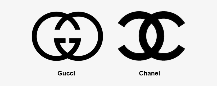
Do you recognize these two monograms? Gucci and Chanel use quite similar icons. When presented apart, many people tend to confuse which one is which. When shown together, it is actually quite easy to differentiate them. Nevertheless, the similarity cannot be ignored. To decide whether one is inspired by another, simple look at the icon is not enough. These brands operate for years and have rich histories. So do their logo designs. Hence, there were plenty of factors which influenced the way the company presents itself in today’s times.
One myth says that both monograms are initials of the brands’ founders: Coco Chanel and Guccio Gucci. It’s presumably accurate information for Gucci but no one knows the real reason for Chanel’s CC. Some sources claim that it’s from a pattern on stained glass in a monastery where Coco grew up. Others argue that it’s from two Cs in Coco. Some say it’s from Chanel and Boy Capel who was Chanel’s lover that financed her first fashion shop selling hats. No matter what the reason is, the histories of these two brands differ and, therefore, so do the concepts behind their monograms.
The black and simple

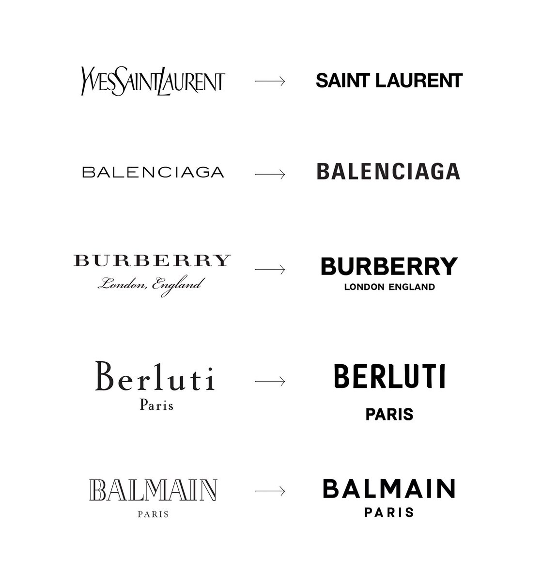
Other brands, who aren’t that much into monograms but prefer to display their full names, rebrand and make their logos look almost… identical! Have a look at the old logos of Yves Saint Laurent. Balenciaga, Burberry, Berluti and Balmain. Each was unique, differentiable and presented the company’s values, style, and essence. After rebranding, they all look pretty much the same with barely noticeable differences.
Why would they do that? There are multiple reasons but let’s start with the first visible elements: colors and fonts. Most high-end brands use black because it stands for luxury and represents a sophistication. It attracts attention but at the same time, it doesn’t steal the show and takes eyes away from the most important aspect: the clothes!
As for the fonts, in the old logo designs, the brands would rather use serif fonts. Serif means that there are little strokes at the end of the letters. It gives a classic and traditional feel as well as creates some authority. The new logo designs move from serif to sans-serif fonts. Sans is French for without. So, it’s without those little strokes. The letters are more minimalistic and present a lot more modern look.
The other reasons
Fashion brands want to look more modern because their customers become younger and the times are changing. The old logo designs are simply outdated and irrelevant unless a brand wants to be specifically perceived as traditional and old school. The graphic design trends are changing too and if brands want to keep up with their competition and continue looking appealing to their customers, they must adapt to the game.
There one more reason though, a more practical one. Because of the wide presence of technology and the use of small screens, the logo displays are tiny. If a logo includes a lot of small elements like the strokes at the end of the letters and detailed illustration, when displayed on a smartphone screen, it will become unreadable. All the elements will blend it and show a chaotic image instead of a neat and elegant fashion icon. This reason, however, relates to more than fashion brands only.
Boring or fantastic?
What do you think about similar monograms and logos with look-alike fonts and black colors? Boring? Or perhaps fantastic? It’s certainly a topic many will disagree on. For the takeaway of this article, we want to quote Armin Vit, the co-founder of a graphic design company UnderConsideration, who said that the black and simple logos are “like wearing a black-tie tuxedo. They’re not flashy but leave room for personality to come through in other ways.”
Author bio
Natalia Raben takes care of marketing at DesignBro. Lover of design, photography and the arts.


