
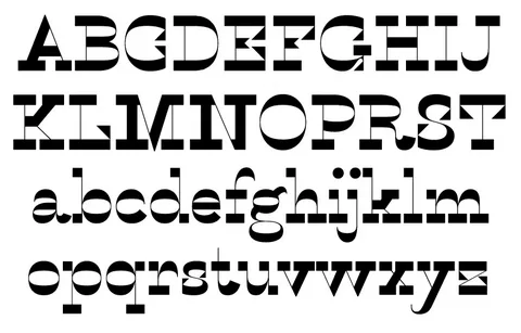
In the dynamic world of typography, Sans Serif fonts have emerged as a popular choice for designers seeking clean, modern, and versatile typefaces. Characterized by their absence of decorative strokes or serifs, Sans Serif fonts offer a straightforward and contemporary aesthetic that resonates with today’s digital era. From websites and mobile apps to branding and editorial design, Sans Serif fonts have become ubiquitous across various platforms and applications. In this blog post, we’ll explore the unique characteristics of Sans Serif fonts, their historical evolution, and tips for effectively incorporating them into your design projects.
- Understanding Sans Serif Fonts: Sans Serif, derived from the French term “sans,” meaning “without,” and “serif,” refers to fonts that lack the small decorative lines or strokes, known as serifs, at the end of characters. Sans Serif fonts are characterized by their clean, minimalist, and modern design, making them ideal for conveying clarity, simplicity, and sophistication in design compositions.
- The Historical Evolution of Sans Serif Fonts: The origins of Sans Serif fonts can be traced back to the 18th century, with early examples appearing in print during the Enlightenment era. However, it wasn’t until the 20th century, with the advent of modernism and the Bauhaus movement, that Sans Serif fonts gained prominence and popularity. Designers and typographers, inspired by the principles of simplicity, functionality, and clarity, embraced Sans Serif fonts as a departure from the ornate and elaborate typefaces of the past.
- Key Characteristics of Sans Serif Fonts: Sans Serif fonts exhibit several distinctive features that set them apart from other typeface categories. Here are some key characteristics of Sans Serif fonts:
- Clean and Minimalist Design: Sans Serif fonts offer a clean and uncluttered appearance, making them highly readable and adaptable across various design contexts.
- Modern and Contemporary Aesthetic: Sans Serif fonts convey a sense of modernity, sophistication, and forward-thinking, aligning well with contemporary design trends and aesthetics.
- Versatility: Sans Serif fonts are versatile and adaptable, suitable for a wide range of applications, from digital interfaces and branding to editorial and print design.
- Legibility and Readability: The absence of serifs and simplified letterforms contribute to enhanced legibility and readability, ensuring clear and accessible communication.
- Popular Sans Serif Fonts and Their Applications: There is a diverse array of Sans Serif fonts available, each with its unique style, personality, and applications. Here are some popular Sans Serif fonts and their common uses:
- Helvetica: A timeless classic known for its neutrality, clarity, and versatility, making it a popular choice for branding, signage, and editorial design.
- Arial: A ubiquitous and widely available font celebrated for its clean, straightforward, and consistent design, suitable for a variety of digital and print applications.
- Roboto: A modern and adaptable font designed specifically for digital interfaces, offering excellent legibility, scalability, and readability across various devices and platforms.
- Futura: An iconic geometric Sans Serif font characterized by its geometric shapes, clean lines, and futuristic aesthetic, making it ideal for logos, headlines, and creative projects.
- Tips for Using Sans Serif Fonts Effectively: To make the most of Sans Serif fonts in your design projects, consider the following tips for effective usage:
- Pairing: Combine Sans Serif fonts with complementary typefaces, such as Serif or Script fonts, to create contrast, hierarchy, and visual interest in your designs.
- Hierarchy and Emphasis: Utilize different weights, styles, and sizes within the same Sans Serif font family to establish hierarchy, emphasize key information, and guide the reader’s eye through the content.
- Spacing and Alignment: Pay attention to letter spacing, line spacing, and text alignment to ensure optimal readability, legibility, and visual harmony in your design compositions.
- Contextual Consideration: Adapt the choice of Sans Serif font to the specific requirements and characteristics of your design project, considering factors such as audience, medium, and message.
- Conclusion: Sans Serif fonts continue to be a go-to choice for designers seeking modernity, clarity, and versatility in their typography. By understanding the unique characteristics, historical evolution, and best practices for using Sans Serif fonts effectively, designers can create compelling, cohesive, and impactful design compositions that resonate with audiences across various platforms and applications.
In conclusion, Sans Serif fonts have firmly established themselves as essential tools in the modern designer’s toolkit, offering a blend of functionality, versatility, and aesthetic appeal that aligns with contemporary design sensibilities. Whether you’re crafting a sleek website, designing a minimalist brand identity, or creating engaging editorial layouts, Sans Serif fonts provide a solid foundation for clear, accessible, and visually appealing typography. By embracing the timeless appeal and adaptability of Sans Serif fonts, designers can elevate their design projects, enhance user experiences, and communicate effectively in today’s fast-paced and evolving design landscape.